







Coming on November 28: the new Happeo Channels experience


6 mins read
At Happeo, our commitment is to provide our customers with an exceptional user experience. We greatly value the feedback we receive from our users and strive to continuously enhance different areas of our platform.
One of the areas we received a lot of feedback on, especially on Productboard and during our Customer Summits, is how responsive Channels are.
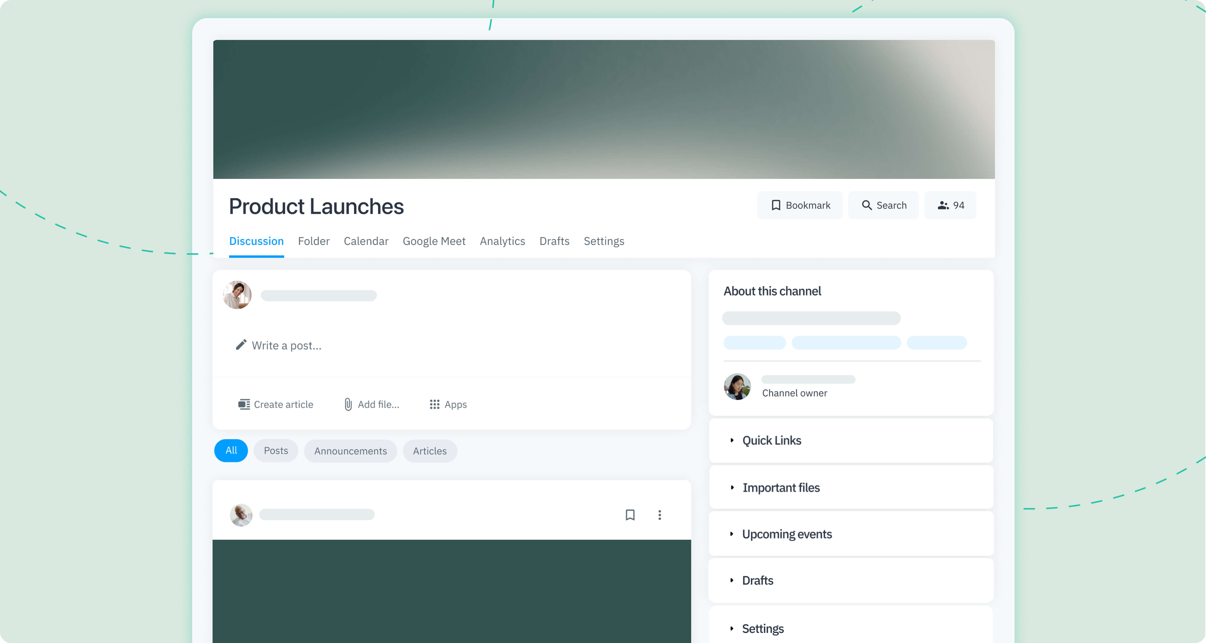
Channels is one of the most used Happeo features, so we want to make sure it meets your expectations in terms of usability, functionality and design. That’s why we decided to make Channels scale well to all screen sizes, creating a more responsive experience. This change prompted a redesign of Channels as a whole because in order to make Channels truly responsive, we couldn’t just tackle the header and its placement.
To achieve this redesign, we’re working with a technology called React, which allows for a better overall Happeo experience, with an emphasis on the interface and overall usability of the product.
The update will go live on November 28. Here’s what you need to know, in a nutshell:
- Channels are more responsive and have an optimized layout
- We implemented a user-centric design that delivers a more seamless Happeo experience
- These changes have received universally positive feedback during beta testing
Here are the functionalities we’ve enhanced with the new Channel UX/UI:
- Drafts widget
- Channel layout
- Header image
- Sidebar and widgets
- Channel description and owner
- Settings widget
Let’s have a closer look at each section and see what’s changed.
Drafts widgets
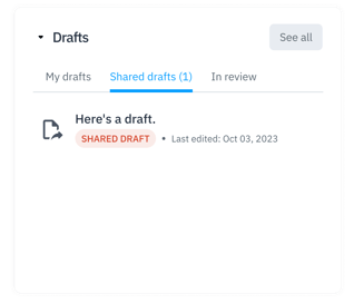
There’s now a dedicated Drafts widget within Channels. This addition enables users to conveniently view their drafts, shared drafts, and drafts in review, all without leaving the main channel view.
.png?width=424&height=412&name=23%20(1).png)
Channel layout
The layout of Channels is now fully centered, which optimizes the use of space and enhances the overall readability of Channels. The redesign results in a more concise presentation of Channel content, with improved cohesion between sections.
.png?width=435&height=220&name=17%20(1).png)
Header image
Based on your feedback, we’ve put the header image in Channels in a container, so it no longer stretches across the full width of the window. This adjustment ensures seamless adaptability of the header image to various screen sizes, eliminating any unwanted cropping of the image while resizing the window. This change greatly enhances the user experience.
.png?width=205&height=323&name=20%20(1).png)
Sidebar and widgets
We've restructured the Channels sidebar into distinct widgets, resulting in a more streamlined design that provides effortless access to a variety of content. This reorganization establishes a more intuitive visual hierarchy, making it easier to analyze the content featured in the Channel. Additionally, we've increased the size of sidebar content, ensuring users can quickly and easily find what they're looking for.
We've also introduced a convenient option to collapse widgets within the sidebar. This functionality saves space in the Channel layout and allows users to hide less frequently used content or widgets.
Please note that the Channel description is not a collapsible widget.
.png?width=342&height=187&name=22%20(1).png)
Description and owner
We've extended the description length, providing more comprehensive information about the Channel. Additionally, we've prominently displayed the Channel owner's information at the top of the sidebar, ensuring users have a clear point of contact when needed. These enhancements make essential Channel details readily available for easy access.
.png?width=235&height=330&name=21%20(1).png)
Settings widget
You’ll notice a sleek redesign of the Settings tab. You can access Notifications settings in the sidebar, just like before. The Widget settings, however, are now accessible from the Settings tab of the Channel menu. Channel owners can toggle the widgets they’d like to be visible in the Channel sidebar. This update harmonizes the visual experience throughout the platform, ensuring a seamless and cohesive design.
If you have any questions or feedback on the update, please contact your Customer Success Manager – we are always happy to help!
What changes are being made to how header images display in the new Happeo Channels update?Header images in Happeo Channels are receiving a significant layout update to resolve common scaling issues. Previously, header images would stretch across the full width of the browser window, which often resulted in awkward cropping or stretching when users resized their screens. To address this, the update places the header image within a dedicated container instead of letting it span the entire screen width. This adjustment ensures that the image adapts naturally to various screen resolutions and devices without losing important visual elements.
By utilising a contained format, the platform guarantees that the header image maintains its intended aspect ratio and composition. Users will no longer have to worry about vital parts of their channel headers being cut off when viewed on different monitor sizes or mobile devices. This improvement is part of a broader transition to a fully centred channel layout, which focuses on optimising the use of screen space and enhancing overall readability.
Additionally, this visual refinement is powered by React technology, which underpins the entire channels redesign. The shift to a containerised header image was heavily influenced by user feedback, specifically highlighting the need for a more responsive and reliable interface. By implementing these adjustments, the platform ensures a more cohesive, polished, and professional appearance for every channel, regardless of the screen size or device being used to access the digital workspace.
How is the Happeo Channels sidebar being redesigned to improve usability?The sidebar is undergoing a comprehensive restructuring to establish a clearer visual hierarchy and make content discovery much easier for users. In the new update, the sidebar content has been reorganised into distinct, individual widgets, and the overall size of the sidebar content has been increased. This ensures that users can quickly locate and analyse the information they need. To help manage screen space, users can now collapse these widgets, allowing them to hide less frequently used content and keep their workspace clean.
An exception to this collapsible feature is the channel description widget, which remains permanently visible. The description itself has been extended, allowing owners to provide much more comprehensive information about the purpose of the channel. Additionally, the channel owner’s contact information is now prominently displayed right at the top of the sidebar. This placement ensures that members have an immediate and clear point of contact if they have questions or need support.
To further centralise channel activities, a brand-new, dedicated drafts widget has been integrated directly into the channel view. This addition enables users to view their personal drafts, shared drafts, and drafts currently in review without needing to navigate away from the main channel page. Collectively, these sidebar changes create a more intuitive and streamlined experience, making essential resources, contact details, and document drafts readily accessible within a modernised, user-friendly interface.
Where do I manage settings and widget visibility in the updated Happeo Channels?Managing your channel configuration is now more streamlined due to a sleek redesign of the settings interface. While some options remain in their familiar locations, others have been moved to create a more consistent visual experience across the entire platform. Specifically, you can still access your personal notification settings directly within the channel sidebar, just as you did in the previous version of the platform. This ensures quick access to your alert preferences.
However, if you are a channel owner looking to customise the sidebar layout, the process for managing widgets has changed. The widget settings have been relocated and are now accessible via the Settings tab located inside the main channel menu. From this dedicated tab, channel owners can easily toggle individual widgets on or off, choosing exactly which modules should be visible to members in the sidebar. This change gives owners precise control over their channel’s layout.
By separating personal notification preferences from administrative layout controls, the platform provides a more structured and intuitive management system. The redesign aims to harmonise the visual setup processes across different areas of the digital workplace. This update eliminates clutter and ensures that channel administrators can configure their workspaces efficiently. If you require further assistance or have specific feedback regarding these administrative changes, you can reach out directly to your dedicated Customer Success Manager.
